My name is Russell Helmstedter. I am a middle school math and computer science teacher at De Anza Academy of Technology & the Arts (DATA). My first exposure to Python was in March of 2020. For some reason, I was stuck at home and couldn’t go out and do things. I decided to learn how to code. After googling things like “what coding language should I learn” and “learn how to code”, I found Al Sweigart’s Automate the Boring Stuff. I was hooked.
I began learning everything I could about Python. I started listening to podcasts, reading blogs, searching for courses and tutorials. The next school year (2020-2021), I had the to opportunity to start teaching the computer science course at DATA. Eventually, I stumbled across PyBites and knew I had to have this be part of the learning experience for my students. I pitched the idea to my principal, reached out to Bob and Julian, and by January of this year we started using PyBites as part of DATA’s computer science curriculum.
The Problem
Somewhere along the line I, ambitiously (read: what was I thinking?), decided that I was going to print student certificates and display them on the wall.
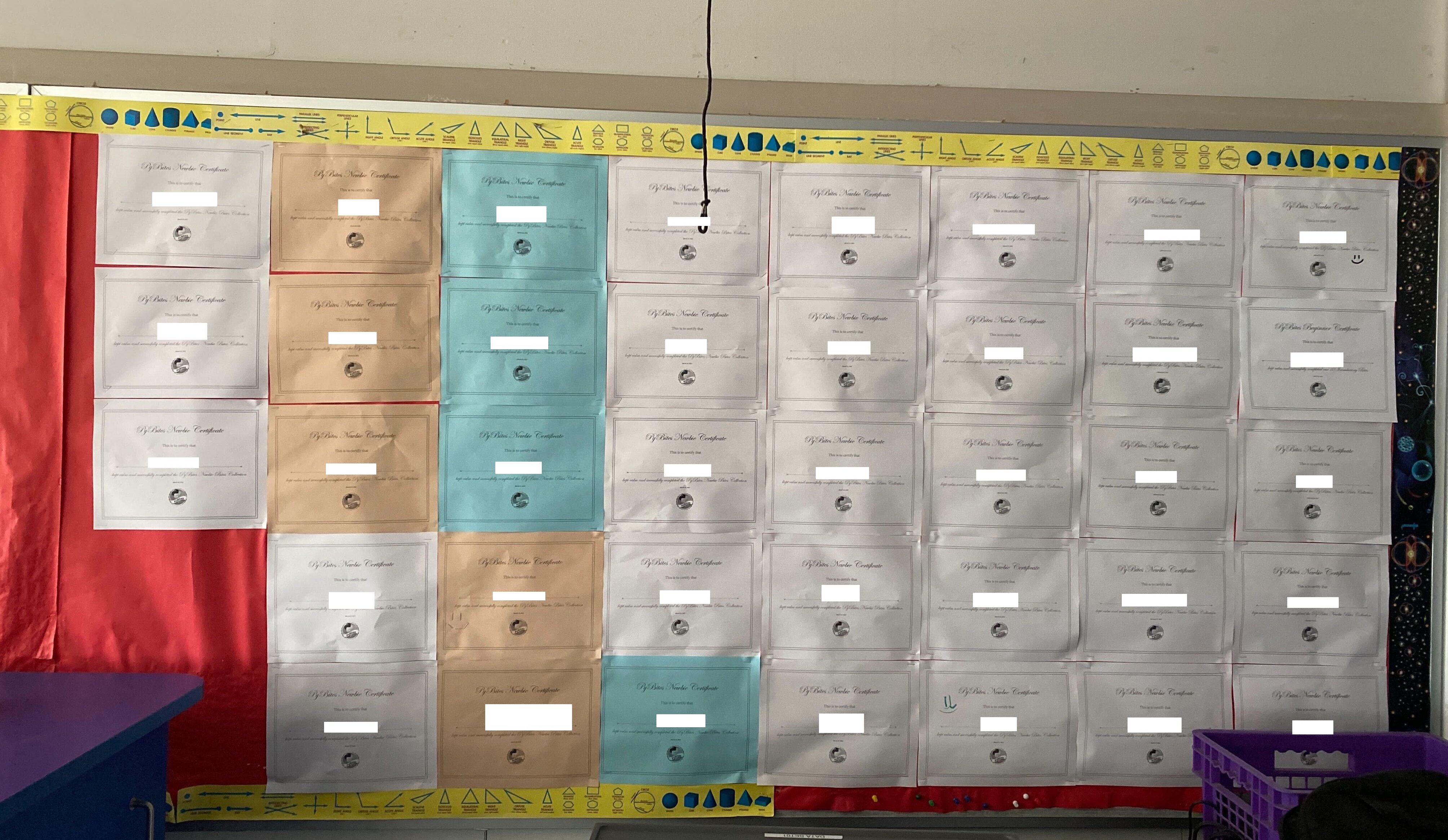
This devolved into a painful process of hapless searching and clicking. First, students are sorted by when they joined the platform, not alphabetical order. Second, their name is built off of their email which makes it difficult to scan quickly (but at least there is Ctrl+F). Then, after located the student’s profile the school admin dashboard it was a click to open their profile, click to choose the certificate (newbie, intro, etc…), click to open the certificate, click the print button (or Ctrl+P) to open print dialog, click print to print, click to close certificate tab (or Ctrl+W), click to close student profile tab. When dealing with one student at a time, not too bad. But with over 130 students at 7 clicks each and possibly doing this for multiple certificates, it adds up quickly. (You know I couldn’t resist doing the calculations right? For 130 students earning a newbie and an intro certificate: 130 * 7 * 2 = 1820 clicks.)
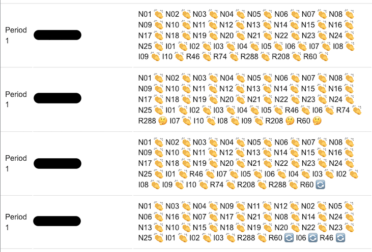
In addition to this, there was the matter of grading. I decided to make assignments for completing the newbie bites, intro bites, and some regular bites. This entailed heading back to the school admin dashboard and parsing the list of students again which looked like the figure below. Each row contains the class, the student name, and all of bites the student has at least attempted followed by an emoji that indicates whether the student had attempted (🔄), completed (👏), or looked at the solution (🤔). How do I know how many of which bites the student has completed? I had to count by hand. To make matters worse, these are listed in the order of attempt, not numerically. If a student went out of order (and trust me, they do) I had to slow down even more and make sure they weren’t missing any. Having my first experience to code being Automate the boring stuff and after watching Raymond Hettinger pound the table time and time again, I thought, there must be a better way.
The Solution
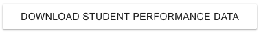
Enter python. I reached out to Bob and asked if he could create a way to export student data into a form that was easier to parse at scale. Boy did he deliver. He added the most beautiful button I have ever laid eyes on.
It allows me to download all my students’ data as JSON. For each student it provides the following information:
{
   "name": str,
   "email": str,
   "class_": str,
   "profile_url": str,
   "newbie_completed": int,
   "intro_completed": int,
   "regular_completed": int,
   "certificates": list[str],
}
Luckily for me, I had just cracked Bite 227: Convert Warcraft json data to csv. So I wrote a little script to save the JSON as CSV. I opened it in Excel and it was glorious. I was able to sort by student name. There was an actual integer value of bites completed for each type of bite. There was even a list of URLs that links to student certificates (more on that to come). But then I had a thought. What if I wanted to compare classes? Maybe see calculate the average number of bites completed per class? Wait, aren’t I going to do this several times a year. I need a way to repeat this process efficiently. So I wrote a little CLI tool that writes a CSV file and plots the data I am interested in directly in my terminal.
The Code
All of the code presented in this article is located in the student PyBites data (spd) github repo. I encourage you to clone it, try it out, and offer any feedback. The data included is based on my students, but any identifying data has been removed.
The Libraries
from pathlib import Path

import pandas as pd
import plotext as plt
import typer
from rich import print
from rich.prompt import Confirm
Path from pathlib was used in both type hinting and for determining where to read and write data the data. By default, the CLI tries to use your current working directory (CWD). Pandas is used to manipulate the data. I even created a new column called “total_completed” which is the sum of the “newbie_completed”, “intro_completed”, and “regular_completed” columns. Plotext is an awesome library that provides an matplotlib like API for data visualization in the terminal. Typer is what creates the slick CLI. And rich provides some nice printing including color for the warning, a convenient Confirm functionality before the user accidentally overwrites the data, and, of course, emojis.
Writing to CSV
CWD = Path.cwd()

cli = typer.Typer()


@cli.command()
def write_csv(
    location: Path = typer.Option(
        CWD,
        "--location",
        "-L",
        help="Directory to read and write from. Default: cwd",
    ),
    json_file: str = typer.Option(
        "cleaned_data.json",
        "--json",
        "-J",
        help="Json file to read. Default: cleaned_data.json",
    ),
    csv_file: str = typer.Option(
        "cleaned_data.csv",
        "--csv",
        "-C",
        help="Csv file to write. Default: cleaned_data.csv",
    ),
) -> None:
    """Writes a csv file based on the json data from PyBites."""
    json_path = location.resolve() / json_file
    csv_path = location.resolve() / csv_file
    if csv_path.is_file():
        print(f"[yellow]:warning: File already exists @ {csv_path}.")
        if not Confirm.ask("Do you want to overwrite the file?"):
            print("Exiting without creating a csv.")
            return
    data = pd.read_json(json_path)
    data.to_csv(csv_path)
    print(f"Successfully created csv file @ {csv_path}")
The tool starts by creating a variable for the CWD and reads and writes files from that location by default. The cli object creates Typer application for the command line interface. Each command uses the @cli.command() decorator. This allows the user to use the name of the function directly on the command line. The arguments of the function are options that can be passed on the command line as well. I tried to use sane defaults like reading and writing in the cwd and a generic name so that you can try out the tool with the data in the repo.
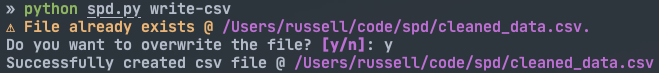
The first command is write_csv (though when run on the command line Typer expects “write-csv”). It takes in a location (directory), a JSON file name (to read), and a CSV file name (to write). For both the json_path and csv_path objects I went with .resolve(). This is probably overkill, but it resolves symlinks, notation such as ~/path/to/location and ../location. As an added bonus, it works on both Windows and Linux/Unix platforms. The function then checks if there is an existing file at csv_path. If there is, it uses rich’s Confirm to prevent the user from accidentally overwriting the data. This is really convenient because I didn’t have to code any of the logic. It just works™. Then the actual conversion. Originally I converted the JSON to CSV using the built-in libraries and a for loop. But since I ended up using pandas later anyway, I went with that to convert it in just two lines code. Finally, it displays the success message. Here is a screenshot:
Cleaning Up the DataFrame
def _clean_data(csv_path: Path) -> pd.DataFrame:
    """Creates a pandas DataFrame from a csv file.

    :csv_path: Path to csv file
    :returns: pd.DataFrame
    """
    df = pd.read_csv(csv_path)
    return (
        df.where(df.class_ != "DEA")
        .assign(
            total_completed=lambda x: x.newbie_completed
            + x.intro_completed
            + x.regular_completed
        )
        .groupby(["class_"])
        .mean()
        .reset_index()
        .round(1)
    )
This is a helper function for the plotting command and you can not call it as part of the CLI. This takes in a path to a CSV file and creates a pandas DataFrame objext. I used chaining (shout out to Matt Harrison) to manipulate the data into a form I can use. It reads as a recipe:
- Keep all of the classes from the “class_” column not called “DEA”. (My colleague Alex Wulff and I are building a Design and Engineering Academy so I created a DEA class for him and another colleague to join PyBites. But I don’t want this in my class data.)
- Create a new column called “total_completed” that is the sum of the three types of bites available. E.g., if a student completes 25 newbies, 10 intros, and 5 regulars, their total_completed column would be 40.
- Group the data according to the “class_” column. For me, this is period 1, period 2, …, period 6. This also results in dropping all of the columns that are not numeric. So the only columns that remain are “newbie_completed”, “intro_completed”, “regular_completed”, and “total_completed”.
- For each class, fill in the average number of bites completed for each column respectively.
- When the data is grouped by the class, the index of each row becomes the class. Resetting the index turns the class back into a column so I can use the classes in the plotting function.
- Round all of the values to one decimal place.
If you want to see this in action check out some sample data in the Pandas Tutor. I have loaded up some sample data for you to play with. It shows you exactly what is happening with each step of the chain.
Plotting the Data
@cli.command()
def plot(
location: Path = typer.Option(
CWD, "--location", "-L", help="Directory to read csv. Default: cwd."
),
csv_file: str = typer.Option(
"cleaned_data.csv",
"--csv",
"-C",
help="Csv file to read. Default: cleaned_data.csv.",
),
sort_by_average: bool = typer.Option(
False,
"--sort-by-average",
"-S",
is_flag=True,
help="Sort by average bites completed instead of class",
),
) -> None:
"""Plots average number of bites completed by class"""
csv_path = location.resolve() / csv_file
data = _clean_data(csv_path)
if sort_by_average:
data = data.sort_values("total_completed", ascending=True).reset_index()
else:
data = data.sort_values("class_", ascending=False).reset_index()
plt.bar(data.class_, data.total_completed, orientation="h", width=0.3, marker="fhd")
plt.theme("pro")
plt.plot_size(75, (2 * len(data.class_) - 1) + 4)
plt.title("Average Bites Completed by Class")
plt.xlim(0, max(data.total_completed) * 1.1)
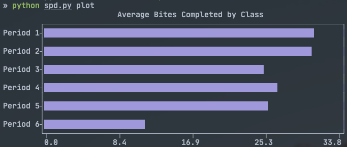
plt.show()This is where the magic of plotting in the terminal happens. This command takes arguments of location, the CSV file name and a sorting option. The result of this function is a horizontal bar graph that displays the average number of bites completed by class. The sort-by-average option is sweet because sometimes I want to view my classes in order of what they are called, and other times I want to sort them in order of performance. After some experimenting, I realized that plotext plots the first row at the bottom of the horizontal chart, so if I want Period 1 on the top and I to sort the DataFrame with ascending=False.
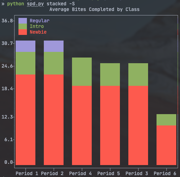
I mostly lifted the plot from plotext’s own documentation. I did need to add the plt.xlim() to force the graph to start at 0, otherwise it gave a distorted view of the data. There is a second function called stacked() that plots a stacked bar chart of the same data. It is pretty similar to plot() so I won’t discuss it here. The results of both commands are shown below.
Bonus: Sanitizing the Student Data to share
from pathlib import Path
import json
from rich import print

JSON_PATH = Path.cwd() / 'student_data.json'
CLEANED_PATH = Path.cwd() / 'cleaned_data.json'

with open(JSON_PATH) as f:
    data = json.load(f)

cleaned_data = []

for i, student in enumerate(data[2:], 1):
    student["name"] = f"student{i}"
    student["email"] = f"student{i}@pybites.org"
    student["profile_url"] = f"https://codechalleng.es/profiles/student{i}"
    student["certificates"] = ""
    cleaned_data.append(student)


with open(CLEANED_PATH, 'w') as f:
    json.dump(cleaned_data, f)
Here is the little script I used to sanitize the data so I could share it with you all. Essentially I loaded up the original JSON data. Then I looped over it replacing sensitive details with generic details. So the student name became “student{number}”, created a made up email and profile, and just made the list of certificate URLs an empty string. Then I created a new json file based on the sanitized data.
Future Plans
Moving forward I want to find a way to streamline grading and printing the certificates. For the certificates I have an idea of opening the URLs with webbrowser and then using pyautogui to click the print buttons for me. Maybe I can split the list of certificates into individual columns with an addition column of “printed” for each. “printed” could be a boolean letting me know if I have already printed that one. Grading will be more difficult. Our current student information system doesn’t allow me to uploads grades via CSV. (Or any other format for that matter, I mean its 2022, c’mon man!)
This was a fun project to put together. It solved a real problem I was facing and I got to mess around with plotting data, which I always love. I want to give a huge shout out to Bob for giving me the option to download the data and encouraging me to write about it. If you have questions, comments, or suggestions for improvement please reach out. I am @RHelmstedter on Twitter or @Russell Helmstedter in the PyBites Slack Channel.